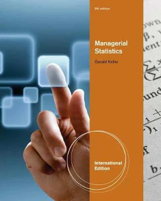
Managerial Statistics, International Edition (with Online Content Printed Access Card)
In this document you will find a summary for the course “Business Research Methods for Pre-Msc” taught to all Pre-masters of FEB at the University of Groningen. The summary contains all the formulas and important underlying theory so that you have a quick overview of the exam material.
Summary / Samenvatting (managerial Statistcis -G. Keller (2012)) - Statistic part of Business Research Methods (EBS001A10)
All for this textbook (14)
Written for
Rijksuniversiteit Groningen (RuG)
Pre msc business administration
Business Research Methods for Pre-Msc (EBS001A10)
All documents for this subject (2)
Seller
Follow
ajakkerman
Reviews received
Content preview
BUSINESS RESEARCH
METHODS
Pre-Master Finance
2021-2022
,Table of contents
Week 1: Introduction, Methodology Statistics .............................................................................. 2
Chapter 1) What is statistics? ............................................................................................................. 2
Chapter 2) Graphical Descriptive Techniques I ................................................................................... 2
Chapter 3) Graphical Descriptive Techniques II .................................................................................. 4
Chapter 4) Numerical Descriptive Techniques ................................................................................... 7
Chapter 6) Probability ....................................................................................................................... 10
Chapter 7) Random Variables and Discrete Probability Distributions .............................................. 12
Chapter 8) Continuous Probability Distributions .............................................................................. 13
Week 2: Sampling distributions, estimation, and hypothesis testing ............................................ 17
Chapter 9) Sampling Distributions .................................................................................................... 17
Chapter 10) Introduction to Estimation............................................................................................ 19
Chapter 11) Introduction to Hypothesis Testing .............................................................................. 21
Week 3: Inference about one population and two populations ................................................... 25
Chapter 12) Inference about a Population ....................................................................................... 25
Chapter 13) Inference about Comparing Two Populations .............................................................. 27
Week 4: Chi-squared tests and nonparametric statistics.............................................................. 33
Chapter 15) Chi-Squared Tests ......................................................................................................... 33
Chapter 19) Nonparametric Statistics............................................................................................... 35
Week 5: Regression analysis ....................................................................................................... 39
Chapter 16) Simple Linear Regression and Correlation .................................................................... 40
Chapter 17) Multiple Regression ...................................................................................................... 45
1
,Week 1: Introduction, Methodology Statistics
Chapter 1) What is statistics?
Statistics is a way to get information from data.
Descriptive statistics deals with methods of organizing, summarizing, and presenting data in a
convenient and informative way. One form of descriptive statistics uses graphical techniques that
allow statistics practitioners to present data in ways that make it easy for the reader to extract useful
information. Another form of descriptive statistics uses numerical techniques to summarize data, e.g.,
mean. The actual technique we use depends on what specific information we would like to extract.
Inferential statistics is a body of methods used to draw conclusions or inferences about characteristics
of populations based on sample data.
Key statistical concepts:
• Population → the group of all items of interest to a statistics practitioner.
o A descriptive measure of a population is called a parameter. In most applications of
inferential statistics the parameter represents the information we need.
• Sample → a set of data drawn from the studied population.
o A descriptive measure of a sample is called a statistic. We use statistics to make inferences
about parameters.
• Statistical inference → the process of making an estimate, prediction, or decision about a
population based on sample data.
o It is easier and cheaper to take a sample from the population of interest and draw
conclusions or make estimates about the population on the basis of information provided
by the sample. However, such conclusions are not always going to be correct. There are
two measures of reliability:
▪ The confidence level is the proportion of times that an estimating procedure will
be correct. (e.g., 95%).
▪ The significance level measures how frequently the conclusion will be wrong and
is used when the purpose of the statistical inference is to draw conclusion about
a population. (a 5% significance level means that samples that lead us to a
particular conclusion, will be wrong 5% of the time).
Chapter 2) Graphical Descriptive Techniques I
Descriptive statistics involves arranging, summarizing, and presenting a set of data in such a way that
useful information is produced. Its methods make use of graphical techniques and numerical
techniques (such as averages) to summarize and present the data, allowing managers to make
decisions based on the information generated.
The two most important factors that determine the appropriate method to use are (1) the type of
data and (2) the information that is needed.
The objective of statistics is to extract information from data. There are different types of data and
information, hence we need to define some terms first:
• A variable is some characteristic of a population or sample.
• The values of the variable are the possible observations of the variable.
• Data are the observed values of a variable. Data is plural for datum → the variable for one object
of interest is a datum. There are three types of data:
2
, o Interval data are real numbers, such as heights, weights, incomes, and distances. We also
refer to this type of data as quantitative or numerical.
▪ Can make all types of calculations.
o Nominal data exists of categorical values. The values are not numbers but instead are
words that describe the categories. Often nominal data is recorded by arbitrarily assigning
a number to each category. However, any numbering system is valid provided that each
category has a different number assigned to it. Nominal data is also called qualitative or
categorical.
▪ Cannot make calculations on nominal data as the numbers are meaningless. Can
only count or compute the percentages of the occurrences of each category.
o Ordinal data appear to be nominal, but the difference is that the order of their values has
meaning. The difference between nominal and ordinal types of data is that the order of
the values of the latter indicate a higher rating. Consequently, when assigning codes to
the values, the order of the values should be maintained.
▪ It is not the magnitude of the values that is important, it is their order.
▪ The critical difference between ordinal and interval data, is that the intervals or
differences between values of interval data are consistent and meaningful.
Because the codes representing ordinal data are arbitrarily assigned except for
the order, we cannot calculate and interpret differences.
▪ Can only make calculations that involve a ranking process such as median.
When we convert higher-level data (interval data) as lower-level (ordinal or nominal) we lose
information. E.g., a mark of 83 gives far more information about the performance of a student than
does a letter grade of A or a pass grade. It is also important to note that we cannot treat lower-level
data types as higher-level types.
Types of Data
Interval
• Values are real numbers
• All calculations are valid
• Data may be treated as ordinal or nominal
Ordinal
• Values must represent the ranked order of the data
• Calculations based on an ordering process are valid
• Data may be treated as nominal but not as interval
Nominal
• Values are the arbitrary numbers that represent categories
• Only calculations based on the frequencies or percentages of occurrence are valid
• Data may not be treated as ordinal or interval
Describing a set of nominal data
The only allowable calculation on nominal data is to count the frequency or compute the percentage
that each value of the variable represents. We can summarize the data in a table, which presents the
categories and their counts, called a frequency distribution.
3
,A relative frequency distribution lists the categories and the proportion with which each occurs. We
can use graphical techniques to present a picture of the data. There are two graphical methods we
can use:
• The bar chart is often used to display frequencies. A bar chart is created by drawing a rectangle
representing each category. The height of the rectangle represents the frequency. The base is
arbitrary.
• The pie chart graphically shows relative frequencies. A pie chart is simply a circle subdivided into
slices that represent the categories. It is drawn so that the size of each slice is proportional to the
percentage corresponding to that category.
The bar chart focuses on the frequencies and the pie chart focuses on the proportions.
Describing ordinal data
There are no specific graphical techniques for ordinal data. Consequently, when we wish to describe
a set of ordinal data, we will treat the data as if they were nominal and use the techniques described
above. The only criterion is that the bars in bar charts should be arranged in ascending (or descending)
ordinal values; in pie charts, the wedges are typically arranged clockwise in ascending or descending
order.
Factors that identify when to use frequency and relative frequency tables, bar and pie charts:
1. Objective: Describe a single set of data.
2. Data type: Nominal or ordinal.
Describing the relationship between two nominal variables and comparing two or more
nominal data sets
Techniques applied to single sets of data are called univariate. There are many situations where we
wish to depict the relationship between variables; in such cases, bivariate methods are required.
A cross-classification table (also called a cross-tabulation table) is used to describe the relationship
between two nominal variables. If the two variables are unrelated, than the patterns exhibited in the
bar charts should be approximately the same. If some relationship exists, then some bar charts will
differ from others.
Factors that identify when to use a cross-classification table:
1. Objective: Describe the relationship between two variables and compare two or more sets of
data.
2. Data type: Nominal
Chapter 3) Graphical Descriptive Techniques II
A frequency distribution for interval data is created by counting the number of observations that fall
into each of a series of intervals, called classes, that cover the complete range of observations. These
intervals do not overlap, so there is no uncertainty about which interval to assign to any observation.
Every observation will be assigned to a class. The intervals are equally wide.
Although the frequency distribution provides information about how the numbers are distributed, the
information is more easily understood and imparted by drawing a picture or graph. The graph is called
a histogram, which is created by drawing rectangles whose bases are the intervals and whose heights
are the frequencies.
4
,The number of class intervals we select depends entirely on the number of observations in the data
set. The more observations we have, the larger the number of class intervals we need to use to draw
a useful histogram.
Sturges’s formula can be used to determine the number of classes for a particular number of
observations: Number of class intervals = 1 + 3.3log(n)
Class interval widths: We determine the approximate width of the classes by subtracting the smallest
observation from the largest and dividing the difference by the number of classes:
𝐿𝑎𝑟𝑔𝑒𝑠𝑡 𝑂𝑏𝑠𝑒𝑟𝑣𝑎𝑡𝑖𝑜𝑛−𝑆𝑚𝑎𝑙𝑙𝑒𝑠𝑡 𝑂𝑏𝑠𝑒𝑟𝑣𝑎𝑡𝑖𝑜𝑛
Class width = 𝑁𝑢𝑚𝑏𝑒𝑟 𝑜𝑓 𝐶𝑙𝑎𝑠𝑠𝑒𝑠
We often round the result to some convenient value. We then define our class limits by selecting a
lower limit for the first class from which all other limits are determined. The only condition is that the
first class interval must contain the smallest observation.
The above are guidelines only. It is more important to choose classes that are easy to interpret.
Shapes of Histograms
We describe the shape of histograms on the basis of the following characteristics:
• Symmetry. A histogram is said to be symmetric if, when we draw a vertical line down the center
of the histogram, the two sides are identical in shape and size.
• Skewness. A skewed histogram is one with a long tail extending to either the right or the left. The
former is called positively skewed (right), and the latter is called negatively skewed (left).
• Number of Modal Classes. A model class is the class with the largest number of observations (from
mode which is the observation that occurs with the greatest frequency). A unimodal histogram is
one with a single peak. A bimodal histogram is one with two peaks, not necessarily equal in height.
o Bimodal histograms often indicate that two different distributions are present.
• Bell shape. A special type of symmetric unimodal histogram is one that is bell shaped.
Stem-and-Leaf Display
One of the drawbacks of the histogram is that we lose potentially useful information by classifying the
observations. The histogram focuses our attention on the frequency of each class and by doing so
sacrifices whatever information was contained in the actual observations.
The stem-and-leaf display is a method that to some extend overcomes this loss.
The first step in developing a stem-and-leaf display is to split each observation into two parts, a stem
and a leaf. Can do this in different ways → can make the stem consist of the digits to the left of the
decimal and the leaf the digit to the right of the decimal (12.3 split up in 12 and 3), or can make the
stem number of tens and the leaf numbers of one (12.3 split up in 1 and 2 ignoring the 3). After each
stem, we list that stem’s leaves, usually in ascending order.
The length of each line represents the frequency in the class interval defined by the stems. The
advantage of the stem-and-leaf display over the histogram is that we can see the actual observations.
The number in the left column of the stem-and-leaf display are called depths → each depth counts
the number of observations that are on its line or beyond, so to its lower limit. The interval that
contains the observation that falls in the middle of all the observations (the median) is displayed in
paratheses and indicates the number of observations in that class. The depth above the median counts
the number of observations that are on its line and above the median, so to its upper limit.
5
,Ogive
The frequency distribution lists the number of observations that fall into each class interval. We can
also create a relative frequency distribution by dividing the frequencies by the number of
observations.
The relative frequency distribution highlights the proportion of the observations that fall into each
class. In some situations, we may wish to highlight the proportion of observations that lie below each
of the class limits. In such cases, we create the cumulative relative frequency distribution.
Another way of representing this information is the ogive, which is a graphical representation of the
cumulative relative frequencies.
Factors that identify when to use a histogram, ogive, or stem-and-leaf display:
1. Objective: Describe a single set of data
2. Data type: Interval
Describing time-series data
Besides classifying data by type, we can also classify them according to whether the observations are
measured at the same time (cross-sectional data) or whether they represent measurements at
successive points in time (time-series data).
Time-series data are often graphically depicted on a line chart, which is a plot of the variable over
time. It is created by plotting the value of the variable on the vertical axis and the time periods on the
horizontal axis.
Describing the relationship between two interval variables
A scatter diagram is a technique statistics practitioners frequently need to know how two interval
variables are related. In applications where one variable depends to some degree on the other
variable, we label the dependent variable Y and the other independent variable X. In other cases
where no dependency is evident, we label the variables arbitrarily.
We frequently need to describe verbally how two variables are related. The two most important
characteristics are the strength and direction of the linear relationship:
• Linearity: To determine the strength of the linear relationship, we draw a straight line through the
points in such a way that the line represents the relationship. If most of the points fall close to the
line, we say that there is a linear relationship. If most of the points appear to be scattered
randomly with only a semblance of a straight line, there is no, or at best, a weak linear relationship.
• Direction: In general, if one variable increases when the other does, we say that there is a positive
linear relationship. When the two variables tend to move in opposite directions, we describe the
nature of their association as a negative linear relationship. There is also no relationship and a
nonlinear relationship.
In interpreting the results of a scatter diagram it is important to understand that if two variables are
linearly related it does not mean that one is causing the other. In fact, we can never conclude that one
variable causes another variable → correlation is not causation.
Factors that identify when to use a scatter diagram:
1. Objective: Describe the relationship between two variables
2. Data type: Interval
6
,Chapter 4) Numerical Descriptive Techniques
Measures of Central Location
• The (arithmetic) mean (or average) is computed by summing the observations and dividing by the
number of observations.
∑𝑁
𝑖=1 𝑥𝑖
o Population mean: 𝜇 = 𝑁
∑𝑛
𝑖=1 𝑥𝑖
o Sample mean: 𝑥̅ = 𝑛
• The median is calculated by placing all the observations in order (ascending or descending). The
observation that falls in the middle is the median. The sample and population medians are
computed in the same way.
o When there is an even number of observations, the median is determined by averaging
the two observations in the middle.
• The mode is defined as the observation (or observations) that occurs with the greatest frequency.
Both the statistic and parameter are computed in the same way. For populations and large
samples, it is preferable to report the modal classes.
o There are several problems with using the mode as a measure of central location:
▪ In a small sample it may not be a very good measure
▪ It may not be unique
There are several factors to consider when making our choice of measure of central location. The
mean is generally our first selection. However, there are several circumstances when the median is
better. The advantage of the median is that it is not as sensitive to extreme values of the mean. The
mode is seldom the best measure of central location.
When there is a relatively small number of extreme observations (either very small or very large, but
not both), the median usually produces a better measure of the center of the data. Also the median
provides you the information to which half your statistic belongs.
For interval data, any of the three measures of central location can be used. However, for ordinal and
nominal data, the calculation of the mean is not valid. Because the calculation of the median begins
by placing the data in order, this statistic is appropriate for ordinal data. The mode, which is
determined by counting the frequency of each observation, is appropriate for nominal data (but still
pointless as nominal data have no center)
Let 𝑅𝑖 denote the rate of return (in decimal form) in period i (𝑖 = 1,2, … , 𝑛). The geometric mean 𝑅𝑔
of the returns 𝑅1 , 𝑅2 , … , 𝑅𝑛 is defined such that (1 + 𝑅𝑔 )𝑛 = (1 + 𝑅1 )(1 + 𝑅2 ) … (1 + 𝑅𝑛 ). Solving
𝑛
for 𝑅𝑔 gives: 𝑅𝑔 = √(1 + 𝑅1 )(1 + 𝑅2 ) … (1 + 𝑅𝑛 ) − 1.
• The geometric mean is used whenever we wish to find the “average” growth rate, or rate of
change, in a variable over time. However, the arithmetic mean of n returns (or growth rates) is the
appropriate mean to calculate if you wish to estimate the mean rate of return (or growth rate) for
any single period in the future.
Factors that identify when to compute the mean
1. Objective: Describe a single set of data
2. Type of data: Interval
3. Descriptive measurement: Central location
Factors that identify when to compute the median
1. Objective: Describe a single set of data
7
, 2. Type of data: Ordinal or interval (with extreme observations)
3. Descriptive measurement: Central location
Factors that identify when to compute the mode
1. Objective: Describe a single set of data
2. Type of data: Nominal, ordinal, interval
Factors that identify when to compute the geometric mean
1. Objective: Describe a single set of data
2. Type of data: Interval; growth rates
Measures of Variability
• The range is the difference between the largest and smallest observation.
Range = Largest observation − Smallest observation.
o The advantage of the range is its simplicity. The disadvantage is also its simplicity since
the range is calculated from only two observations, it tells us nothing about the other
observations.
• The variance and its related measure, the standard deviation, are arguably the most important
statistics. They are used to measure variability, but they play a vital role in almost all statistical
inference procedures.
∑𝑁
𝑖=1(𝑥𝑖 −𝜇)
2
o Population variance: 𝜎 2 = 𝑁
∑𝑛
𝑖=1(𝑥𝑖 −𝑥̅ )
2
o Sample variance: 𝑠 2 =
𝑛−1
▪ We use n-1 to correct for the mean in the calculation.
▪ We square the deviations to avoid the “canceling effect” → having positive and
negative values will cancel each other out, resulting in a standard deviation of
zero.
2
1 (∑𝑛
𝑖=1 𝑥𝑖 )
▪ Shortcut for sample variance: 𝑠 2 = 𝑛−1 [∑𝑛𝑖=1 𝑥𝑖2 − 𝑛
]
▪ Because we squared the deviations from the mean, the unit attached to the
variance is the square of the unit attached to the original observations.
• The standard deviation is simply the positive square root of the variance.
o Population standard deviation: 𝜎 = √𝜎 2
o Sample standard deviation: 𝑠 = √𝑠 2
Knowing the mean and the standard deviation allows the statistics practitioner to extract useful bits
of information. The information depends on the shape of the histogram. If the histogram is bell
shaped, we can use the Empirical Rule:
1. Approximately 68% of all observations fall within one standard deviation of the mean.
2. Approximately 95% of all observations fall within two standard deviations of the mean.
3. Approximately 99.7% of all observations fall within three standard deviations of the mean.
8
The benefits of buying summaries with Stuvia:
Guaranteed quality through customer reviews
Stuvia customers have reviewed more than 700,000 summaries. This how you know that you are buying the best documents.
Quick and easy check-out
You can quickly pay through credit card or Stuvia-credit for the summaries. There is no membership needed.
Focus on what matters
Your fellow students write the study notes themselves, which is why the documents are always reliable and up-to-date. This ensures you quickly get to the core!
Frequently asked questions
What do I get when I buy this document?
You get a PDF, available immediately after your purchase. The purchased document is accessible anytime, anywhere and indefinitely through your profile.
Satisfaction guarantee: how does it work?
Our satisfaction guarantee ensures that you always find a study document that suits you well. You fill out a form, and our customer service team takes care of the rest.
Who am I buying these notes from?
Stuvia is a marketplace, so you are not buying this document from us, but from seller ajakkerman. Stuvia facilitates payment to the seller.
Will I be stuck with a subscription?
No, you only buy these notes for $5.39. You're not tied to anything after your purchase.