100% satisfaction guarantee Immediately available after payment Both online and in PDF No strings attached
logo-home
INF3720 Assignment 2 2024 | Due 2 August 2024 CA$3.89   Add to cart

Exam (elaborations)

INF3720 Assignment 2 2024 | Due 2 August 2024

 25 views  1 purchase
  • Course
  • Institution
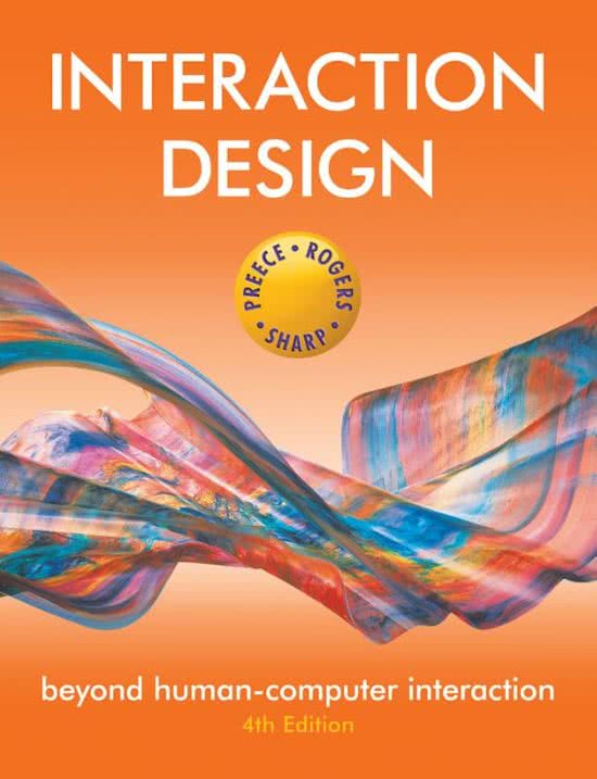
  • Book

Question 1: 13 marks Question 1.1 Many software products suffer from interaction design errors that are annoying to users because they do not follow fundamental design principles. As an interaction designer, how can you ensure that software products are designed to provide a good user experien...

[Show more]

Preview 3 out of 17  pages

  • June 26, 2024
  • 17
  • 2023/2024
  • Exam (elaborations)
  • Questions & answers
avatar-seller
, PLEASE USE THIS DOCUMENT AS A GUIDE TO ANSWER YOUR ASSIGNMENT


Please note that the author of this document will not responsibility for any plagiarizing you
commit.

 Question 1

1.1. Many software products suffer from interaction design errors that are annoying to users
because they do not follow fundamental design principles. As an interaction designer, how can
you ensure that software products are designed to provide a good user experience?

To ensure that software products are designed to provide a good user experience, it is essential to
reduce negative aspects like frustration and annoyance while enhancing positive ones such as
enjoyment and efficacy. This involves developing interactive products that are easy to learn,
effective, and pleasurable to use from the user's perspective.

Key strategies include:
 Understand User Needs: Conduct thorough user research to understand the needs, preferences,
and pain points of your target audience.
 Implement Usability Principles: Adhere to usability principles like consistency, feedback,
and error prevention to create intuitive and predictable interactions.
 Iterative Design and Testing: Employ an iterative design process, continuously testing and
refining the product with real users to identify and address usability issues early.
 Accessibility: Ensure that the product is accessible to users with varying abilities, following
guidelines such as WCAG (Web Content Accessibility Guidelines).
 Aesthetic and Minimalist Design: Avoid unnecessary elements and focus on clean, aesthetic
designs that enhance user satisfaction and usability.

(Rogers et al. - Page 2)

1.2. There is a fine line between an interaction that works and one that is usable. Designing
interactions that work and are usable is achievable if design principles are appropriately applied.
Discuss the design principles that guide interaction design.

 Visibility: This principle ensures that users can easily see what functions are available.
Controls, options, and information should be visible and easily accessible. Effective visibility
reduces the user’s cognitive load and helps users understand what actions are possible at any
given moment. For example, buttons and icons should be clearly labeled and easily
identifiable.

 Feedback: Providing feedback is essential to inform users about what action has been
performed and what result has been achieved. Feedback can be visual, auditory, or haptic. For
example, a button click can be accompanied by a visual change, a sound, or a vibration,
indicating that the action has been recognized and processed. Timely feedback helps users feel
in control and understand the system's status.

 Constraints: Constraints guide user actions by limiting the options available, thus reducing the
chance of error. There are different types of constraints, including physical (e.g., a slider that
can only move within a certain range), logical (e.g., graying out unavailable options), and

, cultural (e.g., using common symbols and conventions). Constraints help users navigate the
system more easily and prevent unintended actions.

 Consistency: Consistency involves using similar design patterns and behaviors across different
parts of the application. This makes the system predictable and easier to learn. Consistent use
of colors, fonts, terminology, and layout helps users transfer knowledge from one part of the
application to another, enhancing usability.

 Affordance: Affordance refers to the design elements that suggest how an object should be
used. For example, a button looks like it should be pressed, and a slider looks like it should be
dragged. Affordances help users understand the actions they can take without the need for
additional instructions. Good affordances align with users' prior experiences and expectations.

(Rogers et al. - Page 27)

1.3. Identify and discuss five usability goals. Also, provide one positive or one negative comment
regarding the usability of myUnisa that you have experienced for each of the goals.

Effectiveness
 Definition: Effectiveness refers to the accuracy and completeness with which users achieve
their goals using the system.
 Comment: Positive - myUnisa effectively allows students to access their course materials and
submit assignments, ensuring that their educational tasks are completed accurately and
comprehensively.

Efficiency
 Definition: Efficiency measures the resources expended in relation to the accuracy and
completeness of goals achieved. It often involves time and effort.
 Comment: Negative - Navigating through myUnisa can sometimes be cumbersome and
time-consuming due to slow page load times and a complex menu structure, reducing overall
efficiency.

Safety
 Definition: Safety involves protecting users from errors and ensuring that the system prevents
catastrophic failures.
 Comment: Positive - myUnisa has effective error prevention mechanisms, such as
confirmation dialogs for critical actions like assignment submissions, which help to ensure
safety and prevent accidental data loss.

Utility
 Definition: Utility refers to the system’s ability to provide all the necessary functions to
perform the tasks effectively.
 Comment: Positive - myUnisa offers a wide range of functionalities, including access to
lecture notes, discussion forums, and communication with lecturers, providing high utility for
students' academic needs.

Learnability
 Definition: Learnability is how easy it is for users to accomplish basic tasks the first time they
encounter the system.
 Comment: Negative - New users may find myUnisa difficult to navigate initially due to its
extensive and somewhat unintuitive interface, which can hinder learnability.

The benefits of buying summaries with Stuvia:

Guaranteed quality through customer reviews

Guaranteed quality through customer reviews

Stuvia customers have reviewed more than 700,000 summaries. This how you know that you are buying the best documents.

Quick and easy check-out

Quick and easy check-out

You can quickly pay through credit card or Stuvia-credit for the summaries. There is no membership needed.

Focus on what matters

Focus on what matters

Your fellow students write the study notes themselves, which is why the documents are always reliable and up-to-date. This ensures you quickly get to the core!

Frequently asked questions

What do I get when I buy this document?

You get a PDF, available immediately after your purchase. The purchased document is accessible anytime, anywhere and indefinitely through your profile.

Satisfaction guarantee: how does it work?

Our satisfaction guarantee ensures that you always find a study document that suits you well. You fill out a form, and our customer service team takes care of the rest.

Who am I buying these notes from?

Stuvia is a marketplace, so you are not buying this document from us, but from seller Aimark94. Stuvia facilitates payment to the seller.

Will I be stuck with a subscription?

No, you only buy these notes for CA$3.89. You're not tied to anything after your purchase.

Can Stuvia be trusted?

4.6 stars on Google & Trustpilot (+1000 reviews)

79271 documents were sold in the last 30 days

Founded in 2010, the go-to place to buy study notes for 14 years now

Start selling
CA$3.89  1x  sold
  • (0)
  Add to cart