100% satisfaction guarantee Immediately available after payment Both online and in PDF No strings attached
logo-home
Summary Human Computer Interaction: Usability Evaluation Portfolio £8.49   Add to cart

Summary

Summary Human Computer Interaction: Usability Evaluation Portfolio

 8 views  0 purchase

This usability evaluation portfolio will be focused on two interactive web site environments of a similar genre. The two websites that are being studied are( Throughout this report there will be a demonstration of a critical understanding of current techniques of task analysis, design approaches ...

[Show more]
Preview 3 out of 26  pages

  • No
  • Observation
  • January 8, 2024
  • 26
  • 2014/2015
  • Summary
book image

Book Title:

Author(s):

  • Edition:
  • ISBN:
  • Edition:
All documents for this subject (11)
avatar-seller
joannekennedy
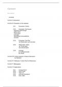
Contents

Description


Contents

Article I.Introduction

Article II. Evaluation of the websites
2.01. Evaluation Criteria

2.02. Evaluation Techniques
Cognitive walk-through
Observation
Think aloud
Interview
Quantitative and qualitative
Controls

2.03. Evaluation Test Plan
(a) Observation and interview

2.04. Observation Tasks
(a) Timed tasks
(b) Untimed tasks

2.05. Findings
(a) mySupermarket
(b) Ocado

Article III. Critical Analysis of Data & Discussion
(a) Statistics

Article IV. Reflection, Further Work & References

Article V. Bibliography

Article VI. Appendices
6.01. Consent Form
6.02. User Profile
6.03. Task List
6.04. Interview Questions
6.05. Data Table

, Article I. Introduction
Thisusability evaluation portfolio
will be focused on two interactive
web site environments of a similar
genre. The two websites thatare
being studied are
(http://www.mysupermarket.co.uk/)
and (http://www.ocado.com/).
Throughout this report there will be
a demonstration of a critical
understanding of current
techniques of task analysis, design
approaches and user interface
implementation with specific
human-computer environments. Methods and guidelines for HCI evaluation will be
critically appraised, and an evaluation will be conducted using proposed evaluation
techniques and evaluative criteria. Various trends will be assessed, towards more
sophisticated interfaces with regards to Web 2.0, online communities, inclusive
design and multimedia.

For the first section of the report a set of criteria will be produced which will be used
to evaluate the websites against one another, two evaluation techniques will be
selected and an outline plan for each of the two techniques will be provided. In order
to critically evaluate the websites and gain valuable information 5 participants will be
used, whose computer
experiences differ from one
another, and the report will then
focus on the discoveries in terms
of usability and user experience for
both websites.

A critical analysis and evaluation
of the data will take place using
the two techniques. Possible
solutions to the usability and user
experience problems encountered
will be suggested.

The report will then summarise
how the evaluations went for both
interactive environments.
Examining findings and conclusions, and clarity of how the process could have been
improved along with clear and concise suggestions for further work.

, Article II. Evaluation of the websites
Section 2.01 Evaluation Criteria
To evaluate the usability, accessibility and user experience of the Ocado and
mySupermarket web applications. An examinationof the evaluation will take place on
a desktop PC and a mobile application in order to generate accurate results.

The criteria selected to evaluate the two websites against werenavigability,
persuasiveness and emotions. By testing the websites against navigability it will
help to conclude how easy it is for users to perform basic tasks, the effectiveness of
the navigation will be testing against “the intuitive use of graphical and textual
navigational cues, way finding aids, breadcrumb trails and site maps.” (University of
Toronto, 2014).

The testing of emotions will determine whether the websites brings the users positive
emotions or negative emotions. Emotion can be a difficult area to capture and study
because it is unpredictable and momentary (Hassenzahl, 2004, p.47). Nevertheless
emotional design has become a dominant part in the creation of outstanding user
experiences for websites (Idler, 2012).

Testing against persuasiveness will specify whether the websites are deliberately
attempting to change the user‟s behaviour in any particular way. It requires
investigating how users feel about making a purchase, whether users would consider
making a purchase and whether the website influences them to make a purchase.
This could be achieved by initially gaining the users trust and appealing to their
sense of security (Schaffer, 2009).


Section 2.02 Evaluation Techniques
Cognitive walk-through
A number of techniques were studied before deciding on the two chosen techniques.
The first evaluation technique that was considered was a predictive evaluation
technique called cognitive walk-through; this is where an expertwill take users
through a number of steps in order to carry out various tasks. In order for this
method to work well the experts will need an in-depth understanding of the tasks that
will need to be performed, a basic understanding of the users and relevant
knowledge and experience of interface design (Lazar, 2010).

However a decision was made against this method because a cognitive walk-
through not only doesn‟t involve the end users but it has the risk of unfairness from
an improper task selection. (Holzinger, 2005).


Observation
The second evaluation technique considered was a usability testing technique called
observation, an observation can be done in a number of ways, as there are various

The benefits of buying summaries with Stuvia:

Guaranteed quality through customer reviews

Guaranteed quality through customer reviews

Stuvia customers have reviewed more than 700,000 summaries. This how you know that you are buying the best documents.

Quick and easy check-out

Quick and easy check-out

You can quickly pay through credit card for the summaries. There is no membership needed.

Focus on what matters

Focus on what matters

Your fellow students write the study notes themselves, which is why the documents are always reliable and up-to-date. This ensures you quickly get to the core!

Frequently asked questions

What do I get when I buy this document?

You get a PDF, available immediately after your purchase. The purchased document is accessible anytime, anywhere and indefinitely through your profile.

Satisfaction guarantee: how does it work?

Our satisfaction guarantee ensures that you always find a study document that suits you well. You fill out a form, and our customer service team takes care of the rest.

Who am I buying these notes from?

Stuvia is a marketplace, so you are not buying this document from us, but from seller joannekennedy. Stuvia facilitates payment to the seller.

Will I be stuck with a subscription?

No, you only buy these notes for £8.49. You're not tied to anything after your purchase.

Can Stuvia be trusted?

4.6 stars on Google & Trustpilot (+1000 reviews)

79373 documents were sold in the last 30 days

Founded in 2010, the go-to place to buy revision notes and other study material for 14 years now

Start selling
£8.49
  • (0)
  Add to cart