100% satisfaction guarantee Immediately available after payment Both online and in PDF No strings attached
logo-home
All must know diagrams for A-level Economics - micro version £12.99
Add to cart

Other

All must know diagrams for A-level Economics - micro version

 0 purchase
  • Institution
  • AQA

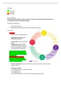
Provides an illustration of each diagram covered in the topics under ‘microeconomics’ at A-level. Additionally, a detailed, analytical description of each diagram is provided, as well as instructions on how to use the diagrams when writing answers to long essay questions.

Preview 4 out of 49  pages

  • January 30, 2025
  • 49
  • 2023/2024
  • Other
  • Unknown
All documents for this subject (2)
avatar-seller
hanmulv
1
How to use paper 1 diagrams

Use diagrams to make your analysis easier and think of points.
If you’re unsure what point to make in a 25 marker, ask yourself: “what diagram could I draw here?”.

The basics of diagrams - use the acronym SCALE:
●​ S for shift. Show the shift of curve in your diagram if a shift is needed (it often is)
●​ C for coordinates. Show the coordinates of any key points.
●​ A for axes - make sure the axes are labelled (price, quantity for example)
●​ L for label - label all curves e.g. S and S1.
●​ E for explanation - describe what happens in the diagram in the text and explain why this happens.

Use this to make sure you don’t forget the basics!

High level diagram use often involves labelling areas:
This could include producer and consumer surplus, revenue for government or firms, welfare loss or gain, the price
mechanism and supernormal profit for example.

When writing 25 markers with 2 analysis points only, you need to extend the diagram analysis.

To do so, consider these methods:
-​ For supply / demand, extend by showing the price mechanism or consumer / producer surplus changes.
-​ For cost / revenue diagrams, can extend by discussing effects on producers (“PIES: profits, investment,
employment/efficiency and shutdown) or consumers (quality and consumer surplus).
-​ For cost and benefit diagrams, can consider further welfare effects. If a tax eliminates a negative externality,
maybe the tax revenue can be used to further improve welfare.
-​ For labour market diagrams, consider the worker surplus (the surplus on the supply side) and associated
effects on poverty and inequality.

These are just examples and there are other ways to do it.
This also only applies if you cannot write enough analysis - if you already have enough analysis there is less need to
extend further.

Other diagrams that are not included above, but that you may wish to revise, include (but are not limited to):

-​ Marginal, average and total product,
-​ Lorenz curve (AQA micro, Edexcel A macro),
-​ Short run to long run elasticity change e.g. on agriculture market and PES,
-​ Price elasticities of demand - perf inelastic, perf elastic, elastic, inelastic unitary. Similarly for PES.,
-​ Types of interrelationships between goods - complements, substitutes, joint demand, joint supply etc,
-​ PED varying along a linear demand curve,
-​ Information gaps eg perceived vs actual MPB,
-​ Shutdown points for some exam boards (Edexcel A),
-​ Contestable market, where the monopoly produces where AR=ATC. / comparing monopoly and perfect
competition outcomes,
-​ Second-degree price discrimination / filling up capacity third degree // peak vs off peak pricing,
-​ First-degree price discrimination,
-​ Perfectly competitive labour market,
-​ Movement along demand or supply,
-​ Engel curves for some exam boards.
-​ Note that demand shifts in a supply-demand diagram can be used for adverse selection, moral hazard and
behavioural bias / nudge analysis.

, 2
4.1.1 Economic methodology and the economic problem

Diagram - PPF Name / analysis - PPF


PPF (Production possibility frontier)

Shows the possible production combinations of 2 goods that a society can produce with a fixed quantity of resources, assuming all
available resources are being utilised to the full.

-​ Points on the PPF = productively efficient; all resources are being used, so it's impossible to produce more of one good
without producing less of another (maximising use of available resources).
-​ The slope of the PPF represents the opportunity cost of producing one more of of good X or Y.

Q = economy producing more of both A and B compared to point F.

D = decision to ^ production, Good X ^, RS = OR, BUT increased opportunity cost of Good Y (we produce more of one good).

P = not all resources are being employed (point lies inside PPF). Therefore, not a productively efficient outcome: resources are being
wasted, we could produce more of both good X and good Y if the economy moved to point F.

The line is curved because factors of production aren’t equally productive in all uses.

Allocative efficiency = producing the right combination of goods to maximise satisfaction of our wants and needs - (only when
consumers’ preferences are known).
Could be anywhere along the PPF, unlikely to be close to either end, e.g. at OA we would only be producing Good Y and not Good X.


PPF illustrates the concepts of resource allocation, trade-of / opportunity cost, productive efficiency, allocative efficiency,
unemployment and full employment of resources:

A = unemployment.
B = unattained production.
C = productive efficiency.
D = allocative efficiency (the point consumers are willing to pay between X and Y).

A -> C / D means ^ quality of FoP.
A -> B means ^ quantity of FoP.


Economic growth:
An economy grows if it produces more g+s in a given time period, this is usually measured by GDP - can distinguish between short &
long term growth.

Short-term growth:

Means producing more goods + services from the resources that are available.
-​ This is possible if the economy is currently operating inside its PPF,
-​ Shown by move from P to F in diagram,
-​ This may occur when an economy emerges from a recession, as unemployed resources are put back into production,

Long-term growth:

-​ Occurs as a result of ^ in productive capacity of an economy.
-​ This is shown when the whole PPF curve shifts outwards to the right.

From AB to CD:
Point Y = the economy is producing more of both capital & consumer goods compared to point X.

long-term growth comes about as a result of acquiring more or better resources.
-​ ^ in supply of workers,
-​ improved education / training,
-​ technological change,
-​ discovery of new mineral deposits,

Growth path A shows the long-term trend of an economy’s productive capacity.
It also demonstrates that choices we make in the present have an opportunity cost in the future.
Suppose there are 2 countries, A & B, initially, they have the same stock of resources, as shown by PPF 1.

-​ Country A is at point X, choosing to devote more of its resources to producing capital goods than country B, which is at
point V.

So country B is enjoying higher living standards in the short-term as it is producing more consumer goods.

BUT

In the long-term, country A will grow at a faster rate as it is building up a greater stock of capital goods.


This is shown by country A moving on to PFF 3, whereas country B only moves onto PFF 2.

Country A is now at point Y, producing more consumer goods as well as capital goods, then country B which is at point W.

By choosing growth path A, a country is making short-term sacrifices of current living standards for long-term growth / gain, compared
to growth path B.

Note that:

Economic growth can be negative too:
-​ In the short-term : an economy can go into a recession.
-​ In long-term : negative growth could result from warfare or natural disaster.

Can be used to highlight opportunity cost, scarcity and economic growth.

, 3
4.1.2 Individual economic decision making - marginal utility

4.1.3 Price determination in a competitive market


Diagram Name / analysis

Supply and demand - demand shift right

Demand shift right could be caused by:
●​ Change in tastes.
●​ Increase in advertising.
●​ Increase in real incomes for a normal good (and a decrease in
real incomes for an inferior good).
●​ Decrease in price of a complementary good or an increase in the
price of a substitute.
●​ NOT a fall in the price of the good itself, as this would lead to a
MOVEMENT ALONG the demand curve, not a shift.

This results in higher price (from p to p1) and higher quantity from q to q1.


Diagram Name / analysis

Supply and demand - supply shift right

Supply shift right can be caused by:
●​ Reduced labour costs due to reduced wages or higher labour
productivity for given wages.
●​ Reduced machinery / capital costs.
●​ Technological improvements that reduce the cost of production.

This reduces the price from p to p1 and increases quantity from q to q1.


Diagram Short run to long run elasticity change e.g. on agriculture market and PES


PED

, 4
PES = refers to a measure that shows the
responsiveness of the quantity supplied of a good or
service to a change in its price.
In simpler terms, it quantifies how the supply of a
product changes when its price does.

Formula for PES:


PES in the short run:
A period in which at least one factor of production is
fixed, e.g. capital (machinery, factory building,etc).
The ability to increase production in response to price
increase in therefore limited, making the supply
relatively inelastic (as seen with curve).

PES in the long run:
All factors of production are variable.
This means firms can respond to changes in demand
by increasing or decreasing production capacity,
making supply relatively more elastic.

The benefits of buying summaries with Stuvia:

Guaranteed quality through customer reviews

Guaranteed quality through customer reviews

Stuvia customers have reviewed more than 700,000 summaries. This how you know that you are buying the best documents.

Quick and easy check-out

Quick and easy check-out

You can quickly pay through credit card for the summaries. There is no membership needed.

Focus on what matters

Focus on what matters

Your fellow students write the study notes themselves, which is why the documents are always reliable and up-to-date. This ensures you quickly get to the core!

Frequently asked questions

What do I get when I buy this document?

You get a PDF, available immediately after your purchase. The purchased document is accessible anytime, anywhere and indefinitely through your profile.

Satisfaction guarantee: how does it work?

Our satisfaction guarantee ensures that you always find a study document that suits you well. You fill out a form, and our customer service team takes care of the rest.

Who am I buying these notes from?

Stuvia is a marketplace, so you are not buying this document from us, but from seller hanmulv. Stuvia facilitates payment to the seller.

Will I be stuck with a subscription?

No, you only buy these notes for £12.99. You're not tied to anything after your purchase.

Can Stuvia be trusted?

4.6 stars on Google & Trustpilot (+1000 reviews)

64419 documents were sold in the last 30 days

Founded in 2010, the go-to place to buy revision notes and other study material for 15 years now

Start selling
£12.99
  • (0)
Add to cart
Added