MIP2602
ASSIGNMENT 4
SOLUTIONS 2023
Unique number: 225269
DUE DATE: 25 AUGUST 2023
Mathematics for
Intermediate Phase
Teachers IV
Page 1 of 16
,ASSIGNMENT 04 (COMPULSORY)
WE WILL NOT GRANT YOU AN EXTENSION FOR THIS ASSIGNMENT.
Due date: 25 August 2023
Unique number: 225269
This assignment contributes 25% to your semester mark.
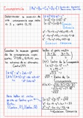
Question 1
1.1 What type(s) of data are best for using the following?
1.1.1 A stem-and-leaf plot (2)
Interval data
A stem-and-leaf plot is suitable for interval data (which can be ordered is
measurable) and small data sets. It gives a quick visual information about an
entire set of data including the shape, spread, and centre.
1.1.2 A bar chart (2)
Categorical data
A bar chat is ideal for categorical data which is data that can be divided into
groups.
1.1.3 Pie chart (2)
Proportional composition or percentages of a whole data
A pie chart is best for displaying the proportional composition or percentages
of a whole.
1.1.4 Scatter plot (2)
Correlation between two numerical variables data
A scatter plot is used to represent a correlation or relationship between two
numerical variables.
1.1.5 Line graph (2)
Time-series data
Page 2 of 16
, A line graph is useful for showing trends over time(time-series data)
1.1.6 A histogram (1)
Continuous data
A histogram is ideal for continuous data and can visualize distributions and patterns.
1.1.7 Box-and-whisker plot (1)
Statistical spread of a data set
A box-and-whisker plot is useful to show the statistical spread of a data set, such as
quartiles and outliers.
1.2 How is the bar graph better than the pictograph? (4)
Bar graph presents more accurate data than pictograph, especially when differences
are small.
A bar graph is often better than a pictorial graph because I can accurately display the
differences between categories. It becomes hard when the differences are small with
photographs.
1.3 When should we make use of scatter plot graphs? (1)
Scatter plot should be used when there’s a relationship between two types of
variables.
Scatter plot graphs should be used to when we want to show the relationship
between two variables. These are most useful when there are a large number of
data points.
1.4 In what circumstances are pie charts and bar charts appropriate to be
used? (4)
Pie and bar charts should be used for categorical data. Pie for proportions, bar for
comparison.
Pie charts and bar charts are best used when the data can be broken down into
categories. Pie charts specifically illustrate proportions of a whole, while bar charts
compare different quantities.
1.5 What makes stem and leaf plots preferable to histograms? (4)
Stem-and-leaf plots are preferable to histograms because they display all the original
data points.
A stem and leaf plot is preferable to histogram because it displays all the original
data points, where histograms use grouped data. So, stem-and-leaf plot can offer
more detailed insights about the distribution of a data set. [25]
Page 3 of 16
ASSIGNMENT 4
SOLUTIONS 2023
Unique number: 225269
DUE DATE: 25 AUGUST 2023
Mathematics for
Intermediate Phase
Teachers IV
Page 1 of 16
,ASSIGNMENT 04 (COMPULSORY)
WE WILL NOT GRANT YOU AN EXTENSION FOR THIS ASSIGNMENT.
Due date: 25 August 2023
Unique number: 225269
This assignment contributes 25% to your semester mark.
Question 1
1.1 What type(s) of data are best for using the following?
1.1.1 A stem-and-leaf plot (2)
Interval data
A stem-and-leaf plot is suitable for interval data (which can be ordered is
measurable) and small data sets. It gives a quick visual information about an
entire set of data including the shape, spread, and centre.
1.1.2 A bar chart (2)
Categorical data
A bar chat is ideal for categorical data which is data that can be divided into
groups.
1.1.3 Pie chart (2)
Proportional composition or percentages of a whole data
A pie chart is best for displaying the proportional composition or percentages
of a whole.
1.1.4 Scatter plot (2)
Correlation between two numerical variables data
A scatter plot is used to represent a correlation or relationship between two
numerical variables.
1.1.5 Line graph (2)
Time-series data
Page 2 of 16
, A line graph is useful for showing trends over time(time-series data)
1.1.6 A histogram (1)
Continuous data
A histogram is ideal for continuous data and can visualize distributions and patterns.
1.1.7 Box-and-whisker plot (1)
Statistical spread of a data set
A box-and-whisker plot is useful to show the statistical spread of a data set, such as
quartiles and outliers.
1.2 How is the bar graph better than the pictograph? (4)
Bar graph presents more accurate data than pictograph, especially when differences
are small.
A bar graph is often better than a pictorial graph because I can accurately display the
differences between categories. It becomes hard when the differences are small with
photographs.
1.3 When should we make use of scatter plot graphs? (1)
Scatter plot should be used when there’s a relationship between two types of
variables.
Scatter plot graphs should be used to when we want to show the relationship
between two variables. These are most useful when there are a large number of
data points.
1.4 In what circumstances are pie charts and bar charts appropriate to be
used? (4)
Pie and bar charts should be used for categorical data. Pie for proportions, bar for
comparison.
Pie charts and bar charts are best used when the data can be broken down into
categories. Pie charts specifically illustrate proportions of a whole, while bar charts
compare different quantities.
1.5 What makes stem and leaf plots preferable to histograms? (4)
Stem-and-leaf plots are preferable to histograms because they display all the original
data points.
A stem and leaf plot is preferable to histogram because it displays all the original
data points, where histograms use grouped data. So, stem-and-leaf plot can offer
more detailed insights about the distribution of a data set. [25]
Page 3 of 16