End Term summary of slides QDA 1
Lecture 1A + B
QDA1
-Introduction
-Population and sample
-Variable types
-Exploring a categorical variable
-Exploring a quantitative variable
-Percentiles and quartiles
-Box plot
-Tukey’s hinges
-SPSS input
Week 1: Data types, exploring your data
Week 2: Probability calculus
Week 3-4A: Estimating a population mean
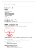
Population: The complete group of interest
All values within the whole group of interest
Sample: A subset of the population for which observations are gathered
The observed values
Random sampling: Each member of the population has equal chance to enter the sample
Definition of variable types:
- Quantitative Measure a number (by nature): SPSS calls it “scale variable”
Continuous: interval of possible values (idealized view)
• Income (Euro)
• Temperature (degrees Celsius)
Discrete: series of isolated possible values
• Number of cars sold (0, 1, 2, 3, …)
• Change in number of employees (..,-2,-1,0,1,2,..)
, - Qualitative Measure a category
Ordinal: ordered categories
• Small, medium or large drink
• Job skill {very low, low, medium, high, very high}
Nominal: unordered categories
• Employed/unemployed
• Brand of a product
Differences have meaning; hence also called “interval variable”
Hierarchy in level of information: 1. continuous 2. discrete 3. ordinal 4. nominal
A variable can always be treated as a variable of a lower type.
Likert variable. To measure judgement.
Still, in research it is often treated as quantitative.
(Why?) This presupposes equal distances between successive categories
This is justified if the categories are consistent with equal distances and a quantitative scale
with numbers is shown in the questionnaire.
Exploring your data: For qualitative data (categorical) we use:
- Frequency table
- Bar chart ¬ to see & compare the frequencies to see the order of categories if ordinal
- Pie chart
- Mode (most frequent outcome)
- Median, only for ordinal data (middle outcome)
For quantitative data we use:
- Histogram
- Mode
- range
- Mean
- Standard deviation
- Skewness
- Kurtosis
- Z-scores
- Percentiles, including Quartiles, Box Plot
A histogram provides information about the distribution of the values:
1. Location (central value)
2. Spread (variability)
3. Skewness (lack of symmetry)
4. Kurtosis (long/thick tails versus short/thin tails)
5. Outliers (remote values)
6. Special features (e.g. gaps in the data)
,How can you see these things from a histogram?
1. Location and 2. spread = Different locations (location = center)
3. Skewness = Compare length/thickness of left and right tail
4. Kurtosis =
Positive kurtosis = Heavy tails, high middle (many extreme values)Leptokurtic distribution
Negative kurtosis = Light tails, low middle (few extreme values)Platykurtic distribution
Dotted line is bell shaped (“normal”) distribution: kurtosis 0
, 5. Outliers 32 Outliers are remote values (isolated extreme values)
6. Special features 33 Example of a special feature: Bi-modal distribution
Central value
Sample mean (or average):
- Balance point
- Best prediction
- Similar: population mean is an estimator of μ
Other measures of the center:
Median: middle observation (after sorting) (3, 5, 8, 8) → median = (5+8)/2 = 6.5
Mode: most frequent value (3, 5, 8, 8) → mode = 8 or derive mode from histogram


